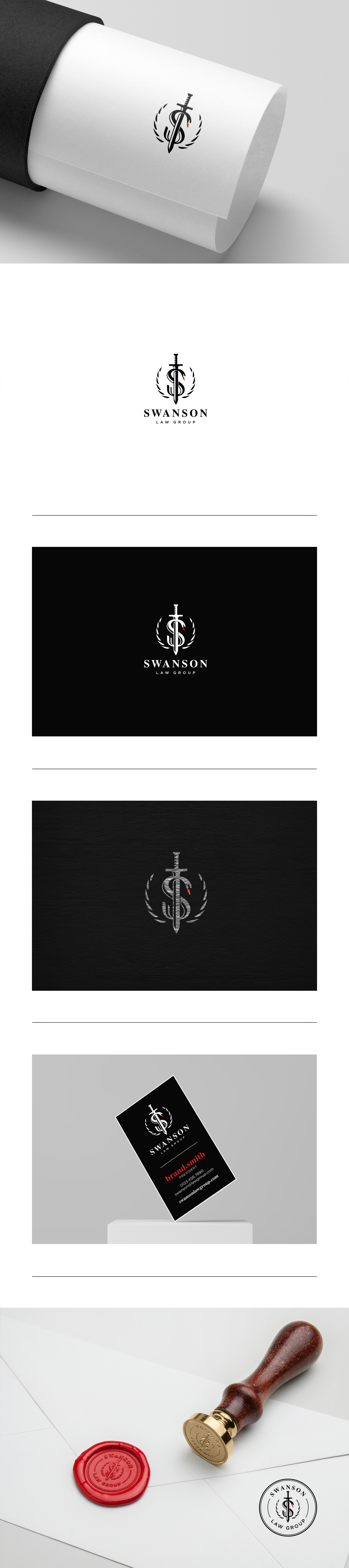
Powerful logo proposal for a personal injury attorney.

20
Created on 99designs by Vista
Abstract swan in the shape of the letter " S ", the wreath that also represents the arching swan wings ( Male swans are known to arch their wings over their backs and charge at the intruder ), and the last one is a sword.
Even thou the " swan " wasn't a requirement in the design brief, I've decided to include it into my design because of the name of the brand which is " Swanson ".
This way I wanted to make a strong connection between the name and the symbol itself, so that the symbol can easily be used without the name and still be recognized.