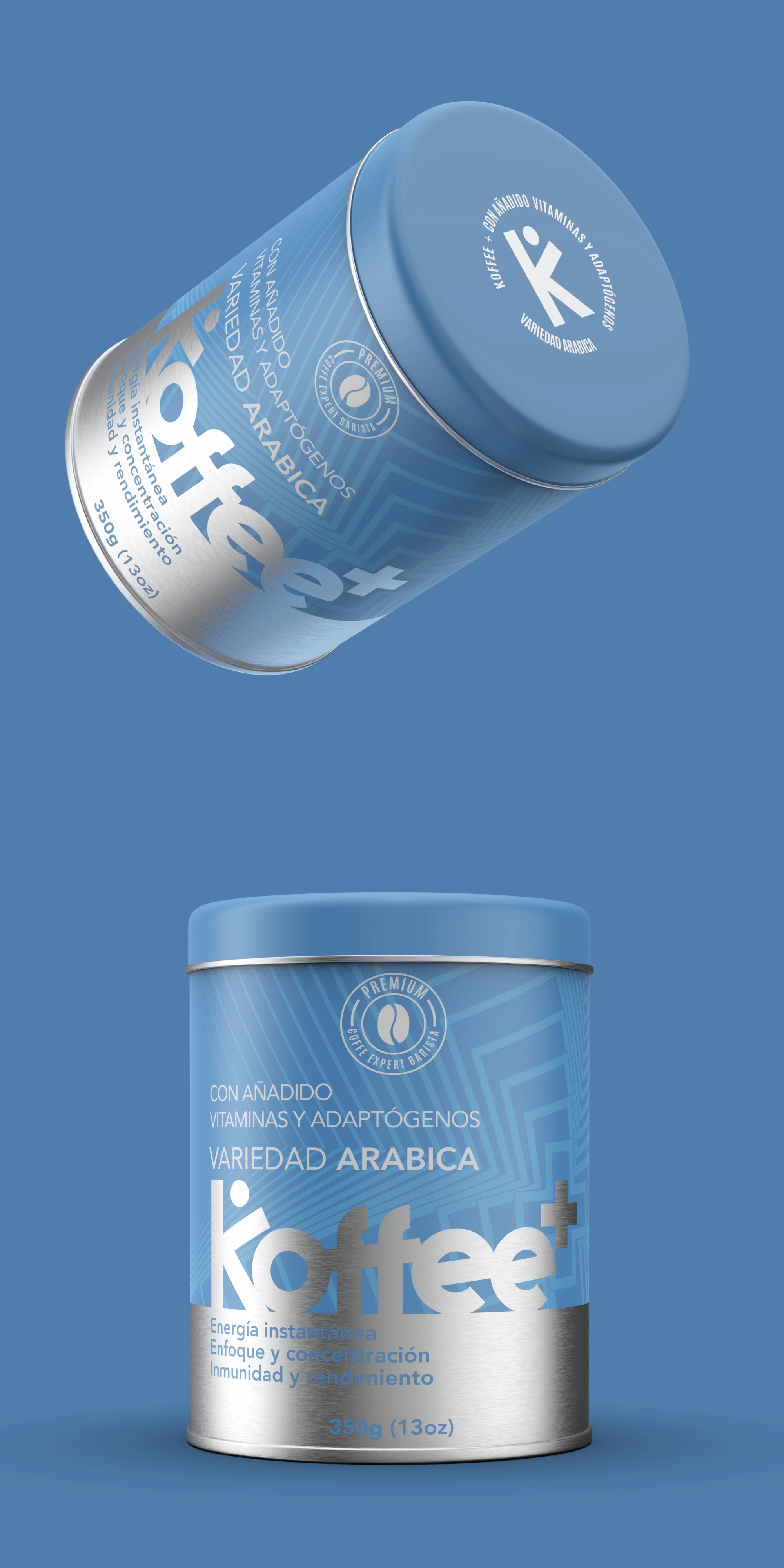

This coffee can label has been meticulously designed to stand out on store shelves, utilizing a striking contrast between matte and glossy metallic finishes. The metal material of the can enhances the premium feel, while the interplay of textures creates an eye-catching effect, ensuring the product grabs attention among competitors.
The bold and interconnected typography reinforces the brand’s modern and dynamic identity, offering a strong visual impact. Additionally, the design allows for seamless product line extensions by incorporating different background colors to create distinct yet cohesive variants within the product family. This flexible approach ensures brand recognition while enabling clear differentiation between flavors or formulations.