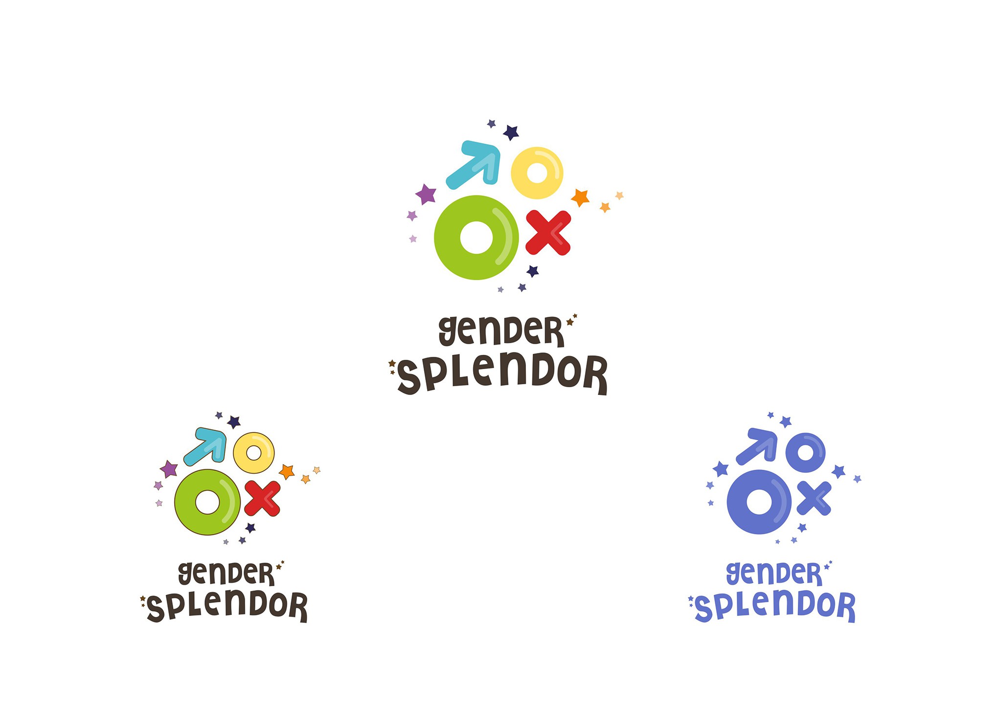

For designing this logo, I thought of using the literal translation of the word 'breaking gender stereotypes' by literally taking the two symbols of gender and breaking them apart.
This symbolizes freedom as you are 'breaking free' and are no longer restricted to follow the gender rules set by society.
I wanted to logo to be simple yet eye catching and fun hence used the four shapes in a playful manner. Arranging the shapes playfully was to make it more attractive to kids and to show that it is a 'fun' brand.
The stars have been added in to make the logo more appealing to kids and to make it more whimsical or magical.
I have given the shapes the colors of the rainbow and used a playful font to compliment it.
Overall, the logo is simple enough to be translated onto various media and since it made of simple shapes ,it can be recognized easily by kids and adults alike.