
"We want to retain our X as the center image but we want it to be pushed in a different direction."
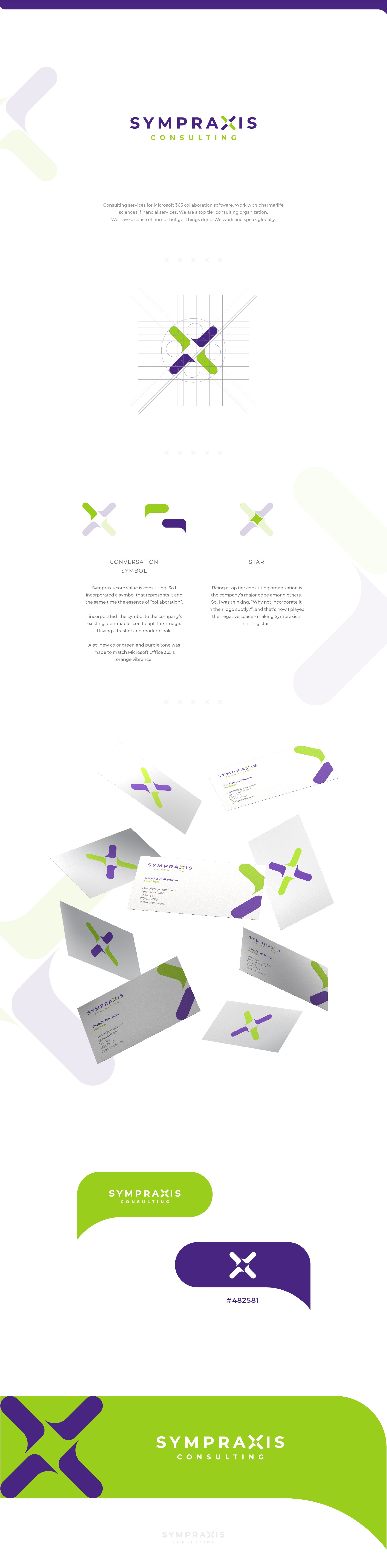
The company's core values are CONSULTING and industry TOP TIER.
As a logo story-teller, what comes into my mind is "conversation" so I was thinking that a conversation icon would suit best for this.
I also made a repetition of the conversation icon to form a letter X and with the help of a grid system to form a perfect symmetry.
The negative space of the X is a "STAR" that represents TOP TIER.
SYMPRAXIS team is now happy with their updated logo that made them say..
"We thought that the design is well-thought and explained well in the mockups. It was also reflective of the fact that communication is a big part of our business and showed that we didn't take that to ourselves too seriously."
You see,
Your logo should not just identify your company but also communicate your core values in a well-thought and well-executed way.
So, what's the story of your logo?