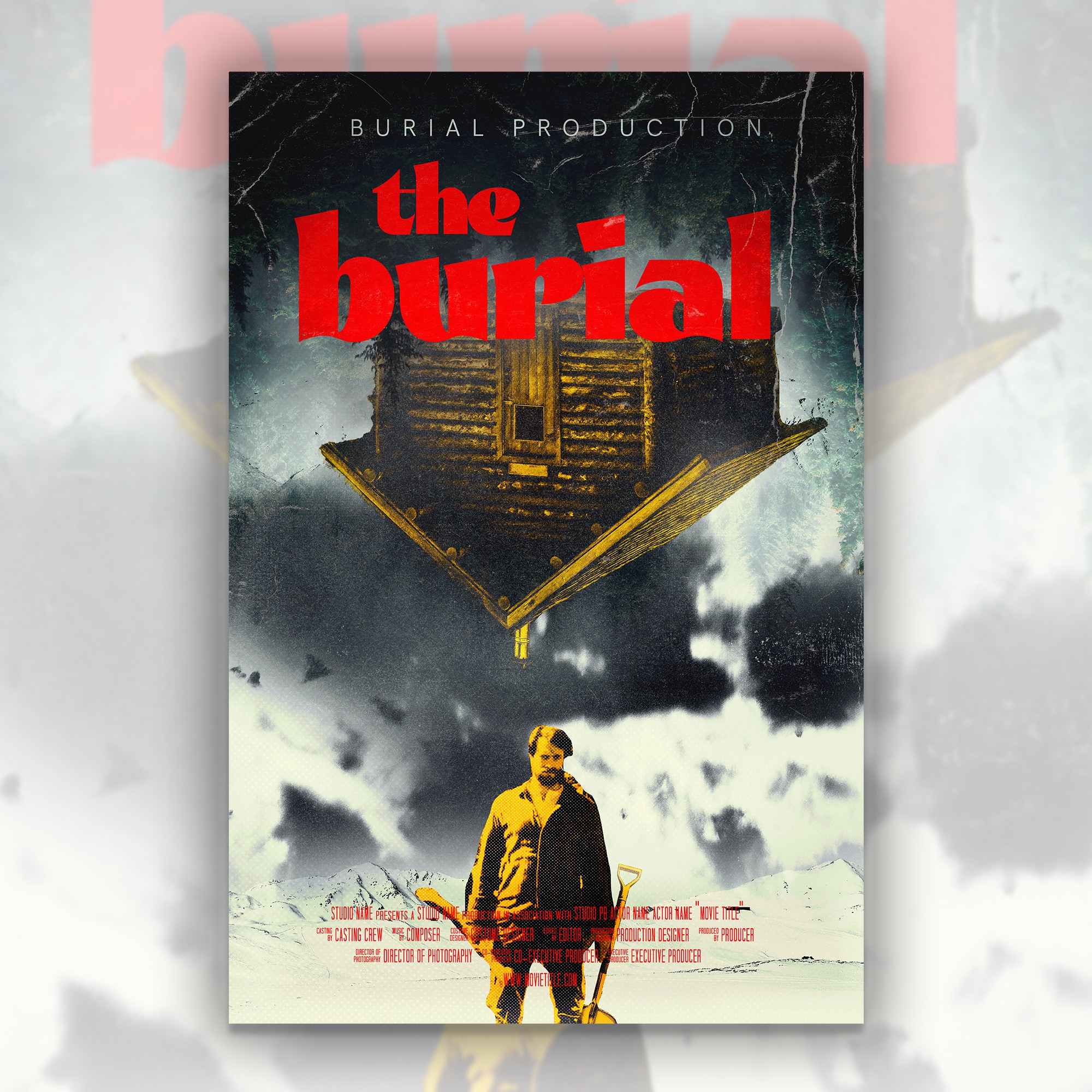

Concept:
A. I think what usually creates dread or unsettling-ness is often when something is "off".
Odd colors or positions of things or shadows
B. Also, I went for more of a retro-ish look for 2 reasons:
・To stand out among the many similarly-modern takes on horror posters.
After all, streaming services consumers flip through hundreds of posters to choose what to watch so something a bit different would more eye-catchy
・The other reason and the most important one: current horror fans seem to be fascinated in retro-style regardless of the media:
—Like in novels such as Grady Hendrix's My Best Friend's Exorcism by
—or Indie horror games which try to replicate VHS look
—Or how analogue horror is getting popular
And movies and shows are catching on to this like with
2021's Malignant or Stranger Things.
That's why a retro-style poster should be the best option for among horror fans in this period. (Especially since Cabin in Woods is such a classic horror trope)