Logo & brand identity deisgn for Cuddlecation.

0
Created on 99designs by Vista
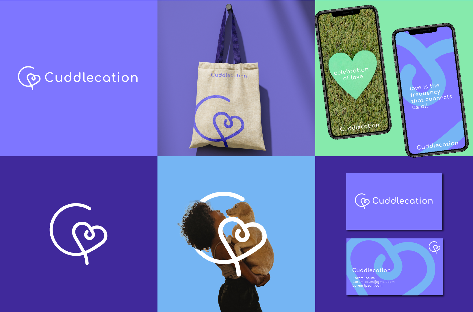
The main element of the logo is the letter "C," which serves as both a visual representation of the brand name and a symbolic depiction of love and connection. I extended one of the lines of the letter "C" to form a heart shape, convey the central theme of love that defines Cuddlecation. The heart with lines making a knot signifies the intertwining and enduring nature of relationships, echoing the brand's commitment to fostering deep, meaningful connections.
I used minimalistic font for the logo name and ensured clarity and readability.
The soft color palette adds feelings of love, compassion, and positivity.