Modern logo for a tech and communication company

0
Created on 99designs by Vista
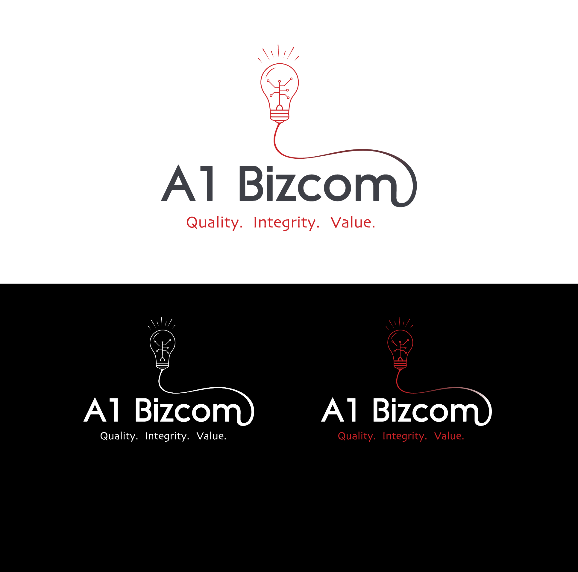
The light bulb that stands above the Company name signify the fact that your company brings new and clever business solutions to their costumers for internet and telecommunication systems.
The telecommunication and internet systems are symbolized inside the light bulb as a wiring / net (internet).
The fonts used are simple, clean and modern and they are also quite masculine thanks to the diagonal and broken lines which give a sense of dynamism.
The logo works even in positive or negative (black or white, as shown) and stays stable and legible even when it is smaller.
The color used are those suggested in the Brief.