
Created on 99designs by Vista
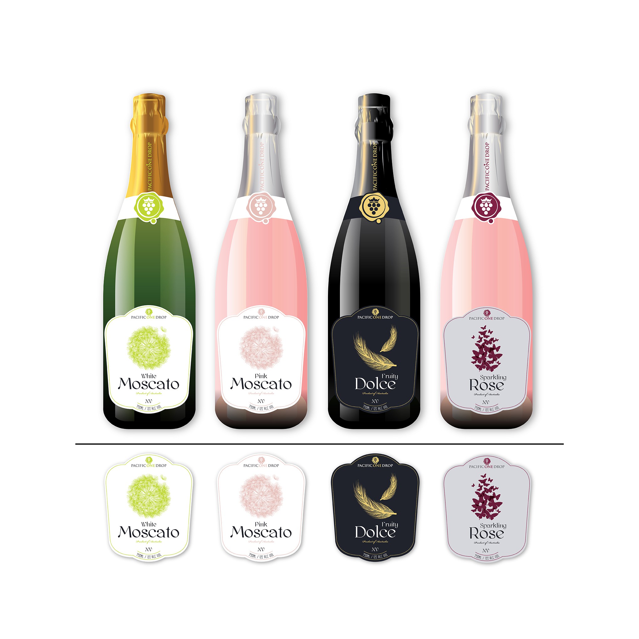
Sparkling wine series.
All the labels have the same type and text style to make it look like the same family. The graphic elements are different to show the difference between the wines, all elements was chosen because of they relationship to the nature and association with lightness and sparkling of the wine.
(Like the bubbles go up in a glass of wine so is the graphic elements) The overall design is minimalistic and European classic style. The colours of the bottles are for suggestion only.