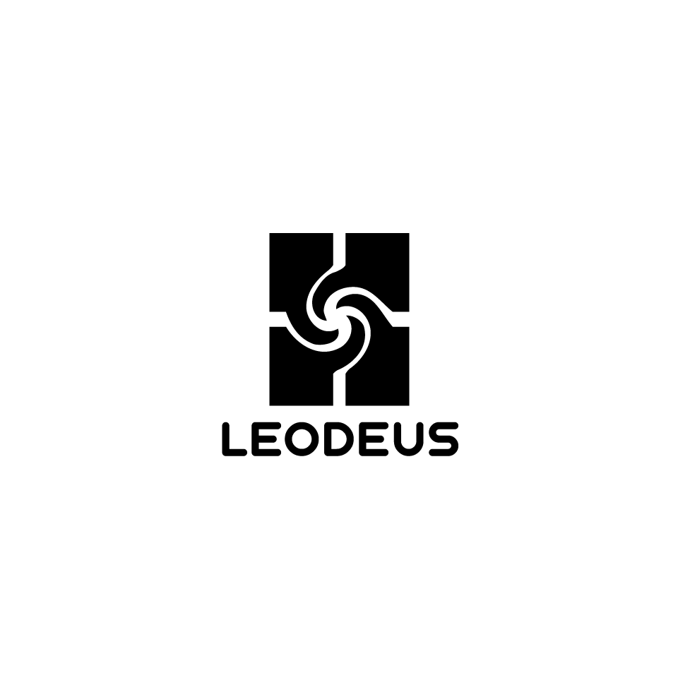
Logo for music/record label and creative collective around underground techno music.

0
Created on 99designs by Vista
Leodeus might also be a party series for likeminded people.
Design descision :
This series of logos conveys the idea of rotation and - which can be considered a symbol of energy, music, festivals, human interaction.
A symbol of Vortex, that draws itself to itself, as it does with us close to us music, festival or party.
I was guided by the principle of "less is more" - less visual noise, less unnecessary details. For better readability of the logo, regardless of the environment of use (flyer, vinyl cover and others).